How to create products users love: applying Emotional Design and UX heuristics in real projects
Jonathan Felipe de Oliveira | Mar 27, 2026

Mobile phones are no longer just gadgets — they’ve become faithful companions. 6.4 billion people use them for work, entertainment, communication, shopping, banking, and so much more. Astonishingly, the average American looks at their phone 262 times daily — that’s every 5 minutes!
The reason we can’t put our phones down? Apps. Global app downloads reached 255 billion in 2022, and about 88% of our screen time is spent on applications.
These numbers show that the app market is more lucrative than ever. But it’s also hypercompetitive. How do you stand out in this digital deluge?
You need to build an app that users can’t resist, which all starts with great design.
In this blog, we’re spilling the beans on mobile app design best practices that can help you build a successful app — one that people will love using over and over. We’ll look at 19 app design guidelines with examples and some tips for choosing a mobile app design company.
But first, let’s define good design and why it matters.
Good mobile app design attracts users with good looks and keeps them hooked by delivering excellent usability and value. Here’s how it breaks down:
In short, designing beautiful apps for mobile devices is just the tip of the iceberg. The most important and impactful part of mobile application design surrounds knowing the user, their needs, and their use case. Only when you know these things can you understand how best to design an app.
Good design is a driving force behind user retention and engagement. Simply put, users who enjoy their experience stick around and use your app more often!
For businesses, the benefits extend beyond the screen. A sleek and intuitive app makes a strong first impression. It helps build a recognizable brand that users trust and remember. And there’s a practical side, too. Using UI and UX best practices right from the start means avoiding redesigns and rebuilds in the future — both of which are costly in time and money.
Building a standout mobile app isn’t just about pixels and code. It’s about creating a seamless experience that keeps people hooked and engaged. Use these mobile app development best practices to build a chart-topping application:
Find out what makes them tick, their preferences, habits, and even the minor gripes they face in their daily lives.
Take a page from Instagram’s playbook. They didn’t just create an app — they crafted an experience perfectly tailored to mobile photography enthusiasts.
By tuning into features that appeal to amateur photographers (like filters and easy photo sharing), Instagram struck a chord that resonated deeply, binding a community of 1.35 billion users.
Mobile navigation should be intuitive and straightforward. Break complex tasks into bite-sized bits to lead users along a clear and coherent path.
Consider Airbnb’s approach. The app streamlines both the booking process (for guests) and the listing process (for hosts) into smaller steps. No wonder it’s been downloaded 52 million times as of 2022!
Predictability in design isn’t about playing it safe — it’s about creating a comforting, familiar environment. Use intuitive symbols and consolidated patterns so users instinctively know how things work.

WhatsApp did this wonderfully. They seamlessly integrated common texting conventions, making the transition from regular texting to WhatsApp almost indistinguishable.
The app’s design — with chat bubbles and clearly-marked call icons — put users in familiar territory, prompting quick and widespread adoption with 2 billion active users and counting!
Have a clear purpose and avoid clutter. Each screen on your app should have a mission, guiding users toward one primary action without overwhelming them with choices.
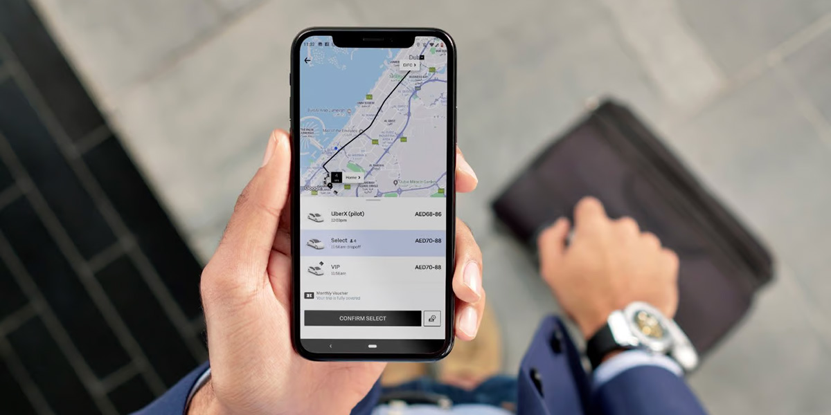
Uber’s brilliance lies in its simplicity. Used by 130 million people at least once a month, it’s a masterclass in keeping things focused. It turned the potentially complicated ride-booking process into a few simple taps.
Features like immediate geolocation, predictive address input, and transparent pricing transformed traditional taxi booking into a fluid digital experience.
Your app’s onboarding experience sets the first impression, so aim to deliver a friendly and intuitive welcome. Design an onboarding process that not only introduces users to your app but also makes them feel like honored guests.
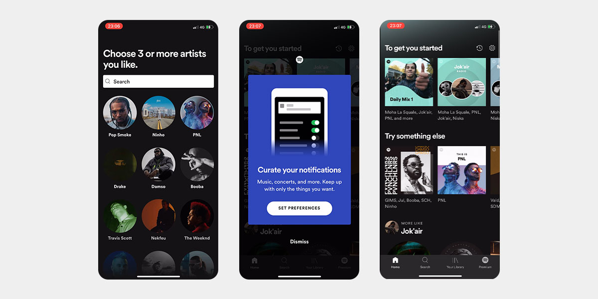
Spotify has perfected this approach. As new users sign up, the app subtly nudges them to pick their favorite songs, instantly curating a playlist that feels uniquely theirs. It’s not just onboarding — it’s a personalized welcome that grew their customer base to 500 million.
Some designers focus only on happy path testing — a tightly-scripted test that expects all users to take the same path from point A to B. But real-world usage isn’t always so predictable. Users sometimes take unexpected routes that can trip up even the best-laid plans.
Enter edge case testing. It identifies and addresses rare user behaviors or conditions that aren’t immediately obvious but can cause major malfunctions. By understanding and preparing for edge cases, you can ensure that your app serves every user efficiently, no matter how they approach it.
Gestures offer direct and tactile navigation that can make the user experience more fluid. But they have to be integrated in a way that simplifies the user’s journey.
Take Tinder. They didn’t just use the swipe gesture — they built their platform around it. Users can swiftly navigate through potential matches with a simple left or right swipe. This approach aligns seamlessly with how people naturally use their devices, boosting user engagement and overall satisfaction. The app is downloaded 3.6 million times each month and has over 530 million users!
Notifications can be helpful, but too many can annoy users. The goal is to inform without pestering.
Fitbit strikes the right balance. It nudges 111 million registered users with reminders to move or celebrate milestones without overwhelming them. The result? They stay engaged without feeling bombarded.
Negative space is not wasted space. In fact, it can help users focus on what’s important.

Look at Apple’s Notes app. Its simple design makes note-taking straightforward and effective. The negative space provides a clean canvas for users’ thoughts. The uncluttered interface promotes focus, ensuring a distraction-free writing experience.
Incorporating new tech is great, but only if it enhances the user experience without complicating it.
Take a cue from Snapchat — the fifth most downloaded mobile app of the decade. They harnessed augmented reality (AR) technology to introduce interactive filters that overlay onto users’ faces, transforming selfies into engaging experiences. These fun AR filters are new and exciting features that don’t make the app harder to use.
The same goes for Google Maps. Even with the integration of real-time traffic updates, street views, and augmented route suggestions, the interface remains intuitive so users can navigate both the map and its features effortlessly.
All sections of your app should offer the same UI and UX so that users feel like they’re navigating a single, cohesive space.
Consider the Amazon ecosystem. Users encounter a consistent layout and design when browsing products, checking out the Today’s Deals section, or exploring their personal recommendations. This uniformity across different sections makes users feel at home wherever they are within the platform.
User trust hinges on data security. People want to know that their data is safe, so be clear about how you’re protecting it. Transparent communication about your data handling practices can significantly boost user confidence and loyalty.
Signal is a stellar example in this space. With its clear commitment to end-to-end encryption, it gives users peace of mind that their private conversations remain just that. This dedication has made it a trusted alternative in the messaging app space.
User feedback helps improve your app. Be open to it and make necessary changes. Collecting and responding to feedback underscores your dedication to user satisfaction and growth.
For example, the popular productivity app Evernote (which serves 250 million users) regularly updates its features based on user suggestions, ensuring that the tool continues to meet the evolving needs of its audience. This lets them address technical issues and foster a sense of community and user involvement.
No one likes waiting. Users expect lightning-fast responsiveness, so make sure your app loads quickly and runs smoothly.
Take Trello as an example. This Kanban-style project management app stands out for its quick-loading boards and real-time task updates, allowing seamless collaboration and progress tracking. It’s now used by over 1 million teams worldwide!
Your app’s icon is the first thing people see. It should be memorable, true to your brand, and set the stage for what’s to come.
Slack owes much of its success to the plaid hashtag (#) icon it used when it first launched. The design was unique and recognizable and hinted at the app’s primary function — facilitating organized, topic-specific chats just like hashtags do.
Think about how people will use your app, from new users to regulars. Aim for a smooth experience that feels connected from start to finish.
Booking does this well. The platform asks newcomers about their travel and destination preferences upon signing up.
As users continue to book stays or experiences, the app refines its recommendations based on their choices and reviews. This keen understanding of the user journey led to 80 million downloads in 2022!
Do you want your app to go global? Understanding regional nuances and sensitivities is key to universal appeal.

Netflix is a master in localization. The streaming app service doesn’t just offer localized subtitles or dubbing — it also curates content based on regional preferences and even produces original shows for specific markets. This tailored viewing experience has helped it gain 238.39 million paid subscribers worldwide!
Errors happen even in apps from tech giants like Meta, Google, and Microsoft. But how you handle them can set your app apart. Be creative. Why not give users helpful alternatives to foster trust and loyalty?
Take ASOS — a popular shopping app regularly used by 25 million people. If a user searches for a product that’s no longer listed, it doesn’t just serve an error page. Instead, it offers similar products or alternative brands.
This thoughtful error handling shows users that a minor hiccup isn’t the end of their shopping journey but an invitation to discover something new.
Accessibility first isn’t just about compliance. It’s about ensuring that every user — regardless of ability — can engage seamlessly with your app.
For example, the VoiceOver feature on iOS provides audio descriptions of on-screen elements to aid visually-impaired users.
YouTube’s automatic captioning system transcribes spoken content in videos for the deaf and hard of hearing. By leveraging these kinds of technology, apps can break down barriers and create more inclusive experiences for all users.
Having unpacked all the mobile app best practices you need to build a great app, it’s time to work with the right app development partner. Use the tips below to find a team ready and able to bring your vision to life.
Before entrusting your project to a development company, ask to see their portfolio. Check their past projects to understand their capabilities, styles, and range. This will give you a clearer insight into their expertise and reliability.
At Cheesecake Labs, we’re proud to have built successful mobile apps for leading brands like Singularity University, Tapcart, Cresol, ACG Brands, Quiver Quantitative, and Exmox — just to name a few. Check out our portfolio to see all the details!
What does their app design process look like? A good mobile app agency prioritizes thorough design and planning to maximize project success before any coding starts.
At Cheesecake Labs, our design approach centers around thoroughly researching and understanding our clients, their business needs, their users, and how an app can provide the most value to everyone involved.
Then we produce and deliver design prototypes, all while ensuring they align with the best approach for both the business and the market.
Our designers consult with developers and tech leads throughout the product definition and product design process to ensure our app design and development align perfectly.
This means that by the time we start coding, we have a solid plan for an app that provides value to your business and your users.
By the end of the design phase, we’ve created comprehensive layouts and clickable prototypes that show what your app will look and feel like.
How do they operate? Understanding their working process lets you see how they approach challenges, make decisions, and ensure timely delivery.
Cheesecake Labs is a nearshore mobile app agency that uses a dedicated teams approach. We work with clients across North America and Western Europe, using regular meetings and dedicated Slack channels for clear and consistent collaboration.
Nothing speaks louder than client satisfaction. Check out platforms like Clutch to get independent feedback on a prospective developer’s performance.
Cheesecake Labs is proud to have earned several Clutch awards. We’ve been the #1 development company in LATAM for three years in a row!
Whether you have a fully-formed app idea or are just starting out, we’re here to help. At Cheesecake Labs, we believe the difference between “good design” and “bad design” lies in your app’s value to your users and your business.
That’s why we spend time carefully defining user personas, mapping out user journeys, creating user stories, benchmarking competitors, and running product definition frameworks — all before beginning work on an app’s visual design.

Get in touch to learn more about the best mobile app design practices we follow every day, or start planning your app design. We’d love to chat about your project!
Mobile application design combines user interface (UI) and user experience (UX). UI is the first impression — the visual appeal, using colors, fonts, and design elements to set the app's tone and style. UX focuses on usability — the feel and functionality of the app, making every interaction smooth and ensuring every feature adds value. Good mobile app design attracts users with good looks and keeps them hooked by delivering excellent usability and value.
Good design is a driving force behind user retention and engagement — users who enjoy their experience stick around and use the app more often. For businesses, a sleek and intuitive app makes a strong first impression and helps build a recognizable brand that users trust and remember. Using UI and UX best practices from the start also helps avoid redesigns and rebuilds in the future, which are costly in time and money.
The post outlines 19 best practices, including: knowing your users, making things easy, being predictable, staying streamlined, simplifying user onboarding, testing edge cases, using gestures, using notifications thoughtfully, embracing negative space, exploring new technologies, staying consistent, prioritizing security, collecting and incorporating feedback, staying speedy, designing a memorable icon, understanding the user journey, localizing, handling errors gracefully, and making the app accessible.
Some designers focus only on happy path testing, which expects all users to take the same path from point A to B. But real-world usage isn't always predictable — users sometimes take unexpected routes. Edge case testing identifies and addresses rare user behaviors or conditions that aren't immediately obvious but can cause major malfunctions, ensuring the app serves every user efficiently.
6.4 billion people use mobile phones, and the average American looks at their phone 262 times daily — every 5 minutes. Global app downloads reached 255 billion in 2022, and about 88% of screen time is spent on applications.