How to create products users love: applying Emotional Design and UX heuristics in real projects
Jonathan Felipe de Oliveira | Mar 27, 2026

Smartphones have been in the market for a while now. After some comings and goings of different players, Android and iOS were established as the main contenders and now represent almost 99% of the global market share. Because of that, virtually any new app idea will focus on these two platforms.
In this article I’ll be talking about the main differences and similarities that every designer should consider when designing UX and UI for iOS and Android. You can be starting from scratch or already have a published app that needs to be adapted for the other platform. For both cases, I’ll be constantly linking the platform guidelines, as they are the main source of reference when designing a new interface.
An app icon is probably the first thing the user will see and where the brand will be more visible.
iOS guidelines define a few rules for its icons: they usually follow a flat style and skeuomorphism – the act of representing or imitating real-world elements – stopped being recommended since iOS7. You should also take into account that all iOS icons have the same shape – a square with rounded corners – and they can’t have transparent background. In the end this square shape is the canvas you’ll be working to create an icon.
Android, in the same way, proposes the material guidelines for icons, that between other recommendations, suggest a range of colors and the use of paper shadows. These are, of course, just recommendations, and most apps don’t follow these guidelines strictly. The main difference from iOS is that Android icons are allowed to have transparent background, so you can basically work with any shape that fits the icon area.
Referring to the basic elements of a mobile interface sometimes can be confusing. Android and iOS name similar items differently and give the same name to different items. It’s always good to know how each bar is called on each platform, it makes a conversation between designers and developers much clearer.
These bars should have consistent styles across the app and follow the platform sizes for a native look and feel. For iOS you’ll find these definitions following this link, while for android they are here.

Even though it’s not common to use a column grid like in the web, sizes, paddings and spaces should be consistent across each platform. Material Design defines a specific grid: 8dp grid for general purposes and a 4dp spacing for icons and types alignment. Meanwhile iOS is not specific about grid, but apps usually use multiples of 4pt and 5pt for sizes and spacings.

Besides styles, navigation is where huge differences will come up. Some components can be exclusive or more common in one platform and this may change the main navigation structure of an app.
iOS uses the tab bar as a main navigation component, while Android can use tabs or a drawer menu. The use of a bottom navigation bar on Android is not very common, but it is part of the Material guidelines, and some apps like Foursquare and Instagram use it. It’s up to you to decide – and test – if your users are ready to use this component.
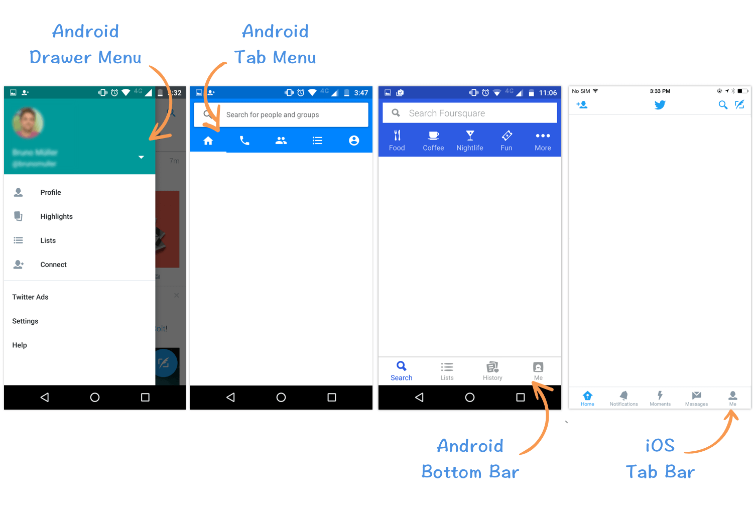
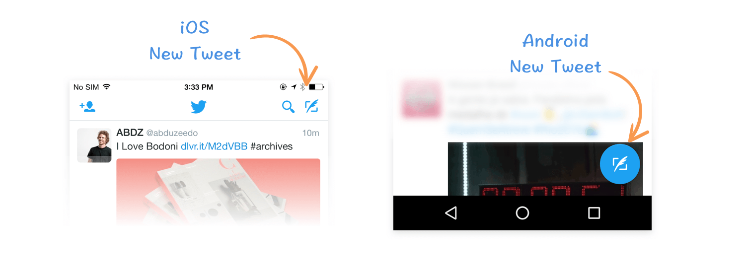
The main actions of a screen, like adding a new item, will usually use a floating button on Android. On iOS they are usually positioned on the right side of the navigation bar.
Another big difference is that Android has the navigation bar, a set of three physical or virtual buttons (back, home and overview), depending on the device. iOS has only the physical home button. This means that Android users can go back anytime, not depending on a back button inside the app. The built in back button will always send the user back in history, even outside the app. On the other hand, iOS users will always need the back button on the interface, otherwise they can get stuck in a screen.
Both Android Material and iOS have default fonts that are encouraged to be used.
Android uses Roboto as the default typeface and Noto for languages that are not covered by Roboto. Both can be downloaded from Google Fonts.
iOS uses San Francisco as the default font. There are two variants of the font, according to the guidelines, SF UI Text is used for text 19 points or smaller, and SF UI Display for text 20 points or larger. San Francisco font can be download from Apple’s website by members of the Apple Developer Program.
Once the design is done and is ready to be implemented, you’ll need to export the assets, and you’ll also find a few differences between Android and iOS. If you use Sketch to build interfaces, there are good tips in my previous article.
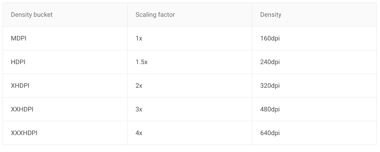
Android devices are manufactured by many different companies, because of that, you’ll find a lot of different screen sizes and densities. Basically Android will require 1x, 1.5x, 2x, 3x and 4x as you can see in the table below.
Meanwhile, on iOS it’s much simpler to work with screen densities: for modern devices, 2x and 3x resolutions will do the job.
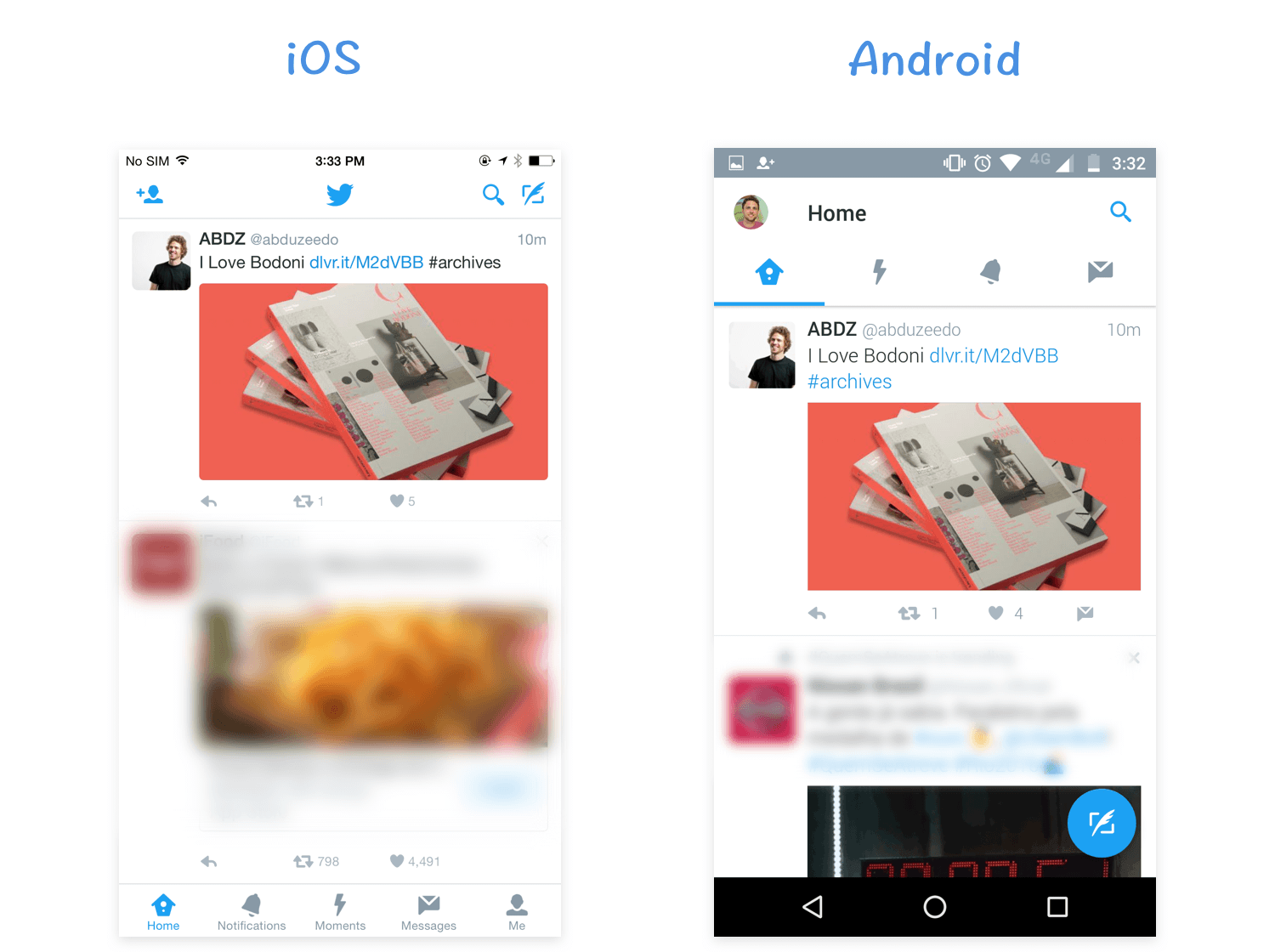
So, we’ve talked about the main differences and similarities between the platforms. I’ve gathered a few screenshots of famous apps on each platform so you can compare them.

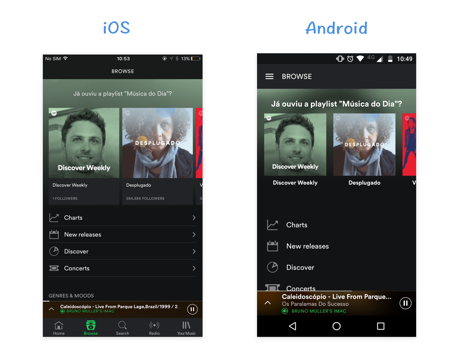

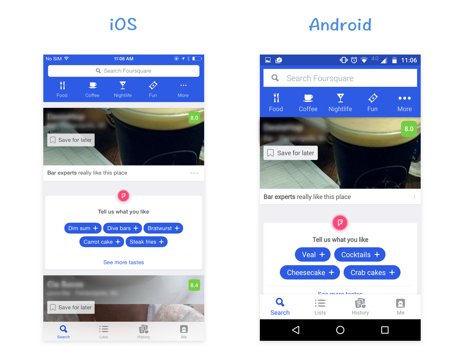
This is just a starting point, there are other several differences, either visually, in components or in interactions that should also be taken into account. Using apps in both platforms and paying attention to these details will also help to understand how similar tasks can be handled differently on each platform. Hope you enjoyed it, feel free to leave your thoughts about it.
iOS icons follow a flat style (skeuomorphism is no longer recommended since iOS7), all have the same square shape with rounded corners, and cannot have transparent backgrounds. Android icons follow material guidelines that suggest a range of colors and the use of paper shadows, and they are allowed to have transparent backgrounds, so you can work with any shape that fits the icon area.
Material Design defines an 8dp grid for general purposes and a 4dp spacing for icons and type alignment. iOS is not specific about grid, but apps usually use multiples of 4pt and 5pt for sizes and spacings.
iOS uses the tab bar as a main navigation component, while Android can use tabs or a drawer menu. Main screen actions typically use a floating button on Android and are positioned on the right side of the navigation bar on iOS. Android also has a navigation bar with back, home, and overview buttons, so users can go back anytime, while iOS only has a physical home button, meaning iOS users always need a back button on the interface.
Android uses Roboto as the default typeface and Noto for languages not covered by Roboto, both available from Google Fonts. iOS uses San Francisco, with SF UI Text for text 19 points or smaller and SF UI Display for text 20 points or larger, available from Apple's website to members of the Apple Developer Program.
Android requires 1x, 1.5x, 2x, 3x, and 4x assets due to the variety of screen sizes and densities across manufacturers. On iOS, 2x and 3x resolutions are sufficient for modern devices.