How one methodology allowed me to create a great design system from scratch and made me a better developer, with principles of componentization, hierarchies and reuse of code.
I have recently had the opportunity to work on a new product from scratch made in React and PWA with a well-crafted and componentized UI at Cheesecake. However, when we discussed with the whole team the best way to approach the development, we ended up having the same old problems that have happened in most past projects, such as:
- Lack of a styleguide for components;
- Lack of precision in estimating development time;
- Great amount of setup time for developers;
- Inconsistency between components and view;
- Repeated code;
- Side effects;
- Very specific components for each page;
We’ve started to build the CSS architecture using the ITCSS methodology that organizes the style files in stacks from generic styles to specific ones, which helps you to scale large projects easily. But along with ITCSS, we were using CSS Modules to scope the components, so we noticed that the component stack was getting huge and even the generic styles were being componentized and reused within other components.
That was the moment in which we paused to rethink our architecture and how we could set the components in a more distributed and organized way. Then we found a methodology called Atomic Design that creates multiple stacks of components, with different hierarchies of complexity and dependence.
What is Atomic Design?
Popularly known within the design world, Atomic Design helps to build consistent, solid and reusable design systems. Plus, in the world of React, Vue and frameworks that stimulate componentization, Atomic Design is used unconsciously; but when used in the right way, it becomes a powerful ally for developers.
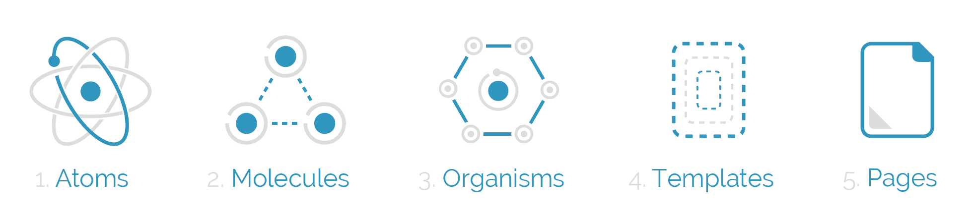
The name Atomic Design comes from the idea of separating the components into atoms, molecules, organisms, templates and pages, like in the image above. But what are the responsibilities of each separated part?
Atoms

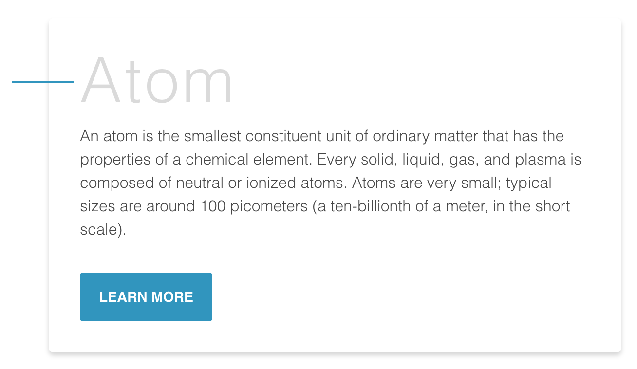
Atoms are the smallest possible components, such as buttons, titles, inputs or even color palettes, animations, and fonts. They can be applied in any context, globally or within other components and templates, besides having many states, such as in this button example: disabled, hover, different sizes, etc.
Molecules
They are the composition of one or more components of atoms. Here we begin to compose complex components and reuse some of those components. Molecules can have their own properties and create functionalities by using atoms, which don’t have any function or action by themselves.
Organisms

Organisms are the combination of molecules that work together or even with atoms that compose more elaborate interfaces. At this level, the components begin to have their final shape, but they are still ensured to be independent, portable and reusable enough to be used in any context.
Templates

At this stage, we stop composing components and begin to set their context. Moreover, the templates create relationships between the organisms and other components through positions, placements and patterns of the pages, but they don’t have any style, color or rendered component. That’s why it looks like a wireframe.
Pages
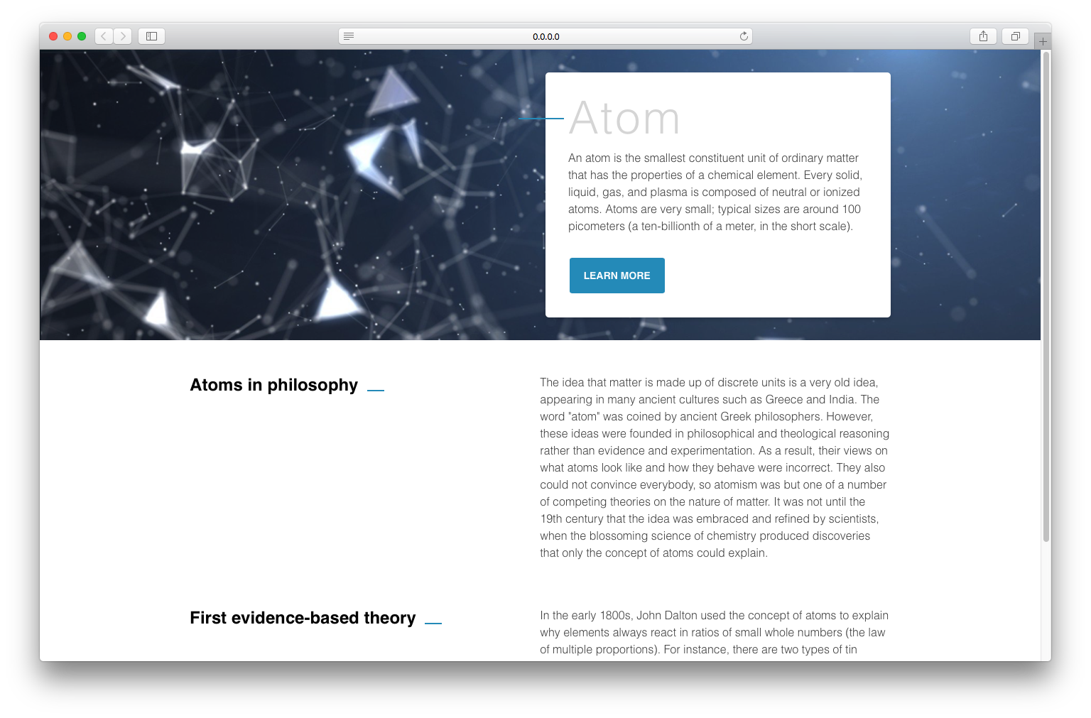
Pages are the navigable parts of the application, and they are where the components are distributed in one specific template. The components get real content and they’re connected with the whole application. At this stage, we can test the efficiency of the design system to analyse if all the components are independent enough or if we need to split them into smaller parts.
How do you use Atomic Design with React?
When we started to use Atomic Design within React, we had to adjust some rules of the methodology to make sure components were reused as much as possible. They had to be stateless, with no positioning styles and no very specific margins, so as to avoid any side effects in the pages of the application.
So with each new component we asked ourselves: “Are these components generic enough to avoid specificity and/or repeated code in whatever context they are used?”
So we were able to write a few rules:
- Atomic Design should have a file of variables and it must be imported by each component;
- The atoms should be written without margins and positions;
- Only the molecules and organisms can set the positions of atoms, but these stacks can’t have any styles of margins and positions;
- Templates have only one function: to set the grid of pages but never positions of specific components;
- Pages render the components with a defined template, and it’s here that Atomic Design will be connected to the rest of the application;
How do you set up Atomic Design in a React project?
Everything shown here is available in a boilerplate on GitHub, which you can test and then use to start your own projects with Atomic Design. It sets up the atoms, molecules, organisms, templates and pages folders in React, plus a UI library to preview each component, so let’s do it:
To build a UI library we used an awesome tool called Storybook, which is a great ally to Atomic Design in React (you can use it for React Native and Vue too). It lets you render the components and list all the states and variations of each one.
With Storybook installed, the folder structure will look like this:

Note that inside the button component there is a file called ‘index.js’, which is the component itself. The ‘styles.css’ file holds the style that will be imported by CSS Modules (here we’ve used BEM CSS inside the structure; I recommend reading the article ‘CSS Architecture with ReactJS’). The ‘stories.js’ file imports the component into Storybook, which looks like this:
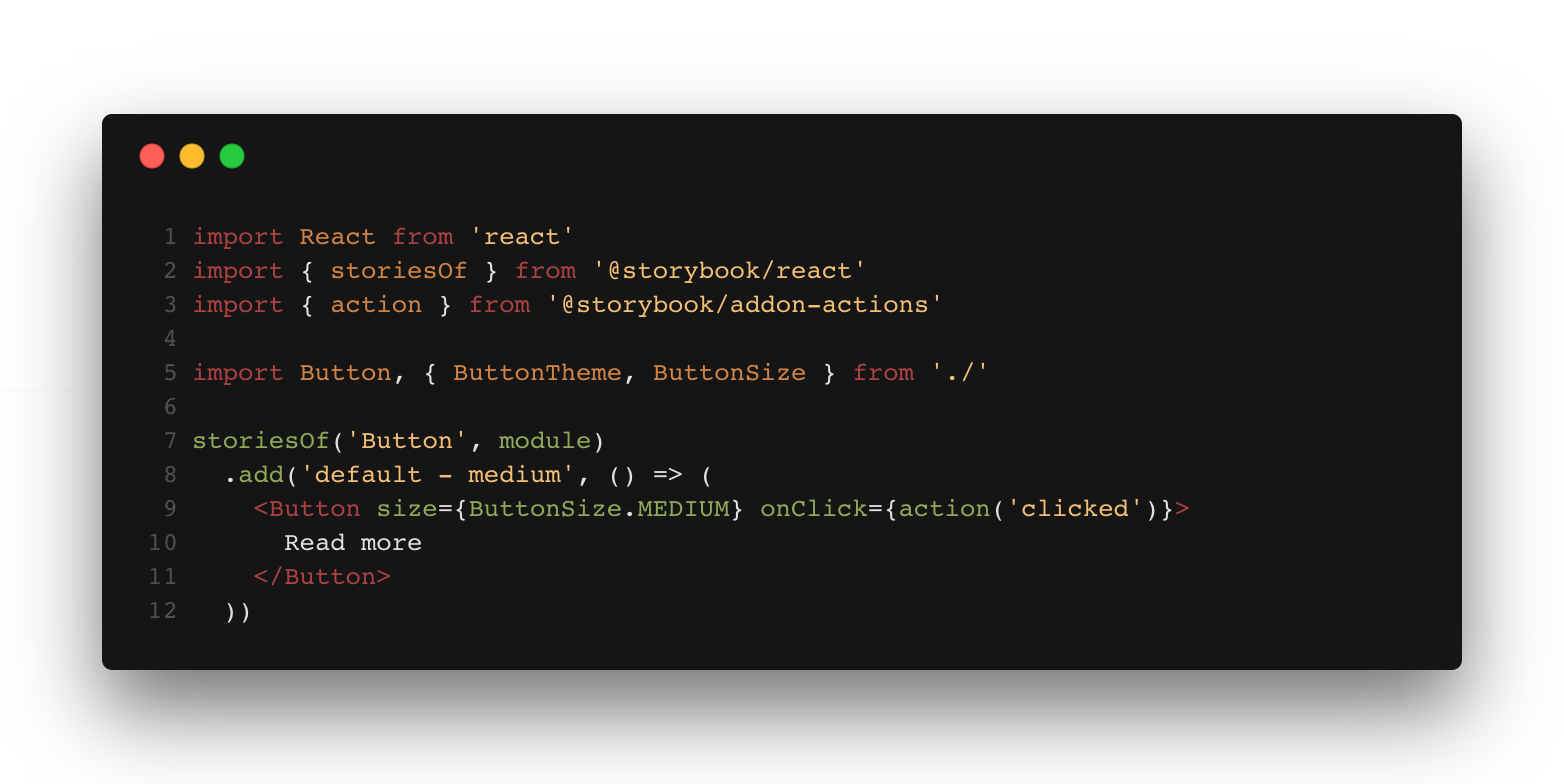
Each ‘add ()’ function is a variation of the component and it is the best approach to describe each state individually rather than a single function, so it becomes easier to highlight and control each one of them. So if you describe all the component variations, Storybook should look like this:
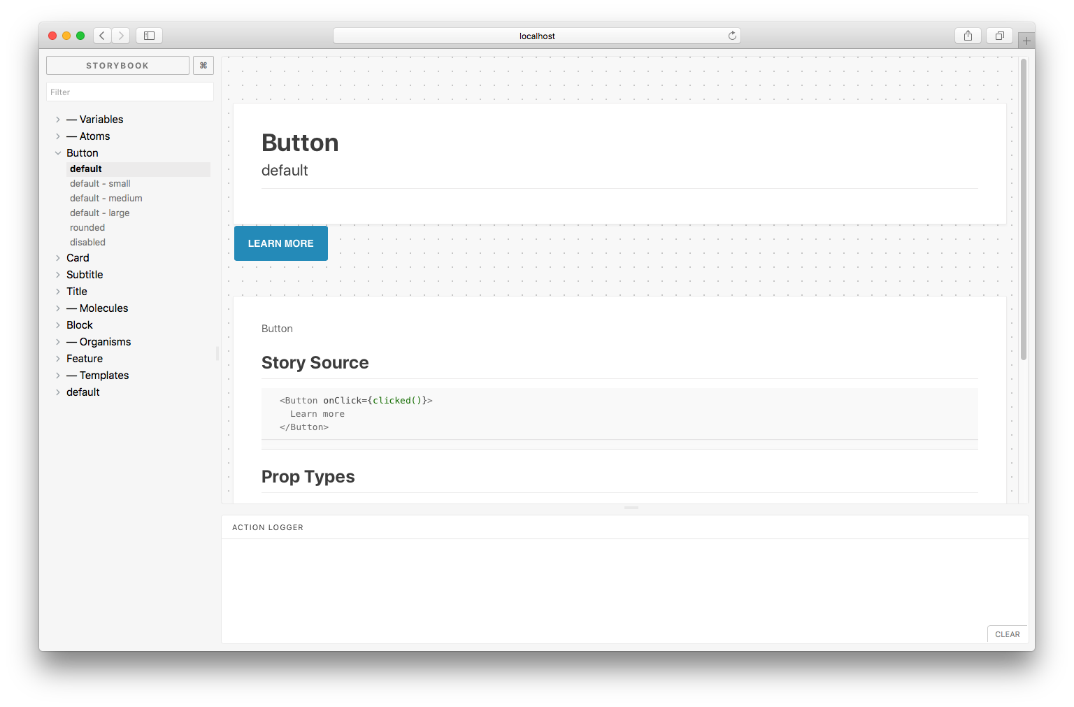
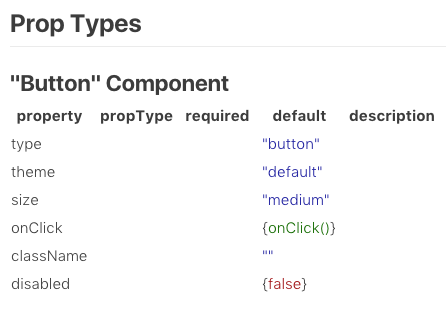
And the coolest part of Storybook is that you can add some ‘addons’, such as the Storybook Info, which does awesome things like: story source, prop types, default values and which values are required or not.
Conclusion
At the end of the project, we reached the initial goals and we believe we left a good legacy, a structure which ensures that the project can grow and that other developers can understand the architecture quickly. Maybe we initially spent some extra time writing stories and so on, but the more the project grows, the more the benefits make clear why we should use such an architecture.
However, we could see that this architecture probably doesn’t work for every project because it depends on several factors. The main one is that the design needs to be thought of in the same way as the development: in an atomic way. But the integration between design and development is a point that every project wants to reach, so it becomes a very positive point for Atomic Design.
References
Using React within a design system
Atomic components managing dynamic React components using atomic design