QuiverQuant is the brainchild of twin brothers looking to make the world of stocks and trading more accessible. Their unique and innovative technology crawls a vast array of publicly available information about investment opportunities and compiles it together.
When QuiverQuant came to Cheesecake Labs, they wanted to extend and optimize their digital experience — making it easier and more enjoyable for users to engage with their data.

The challenge.
Information overload is real. And that’s arguably what QuiverQuant users were experiencing when accessing the website. They either felt paralyzed by the sheer quantity of useful data — which decisions should I make next and why? Or they were struggling to find the data that mattered to them.
By offering a web experience only, QuiverQuant was also missing out on an opportunity — to inspire and excite potential traders with the hottest and most immediately available news and industry movements.
A mobile app was needed. One that would streamline the most essential data, encouraging users to explore the datasets and stick around.

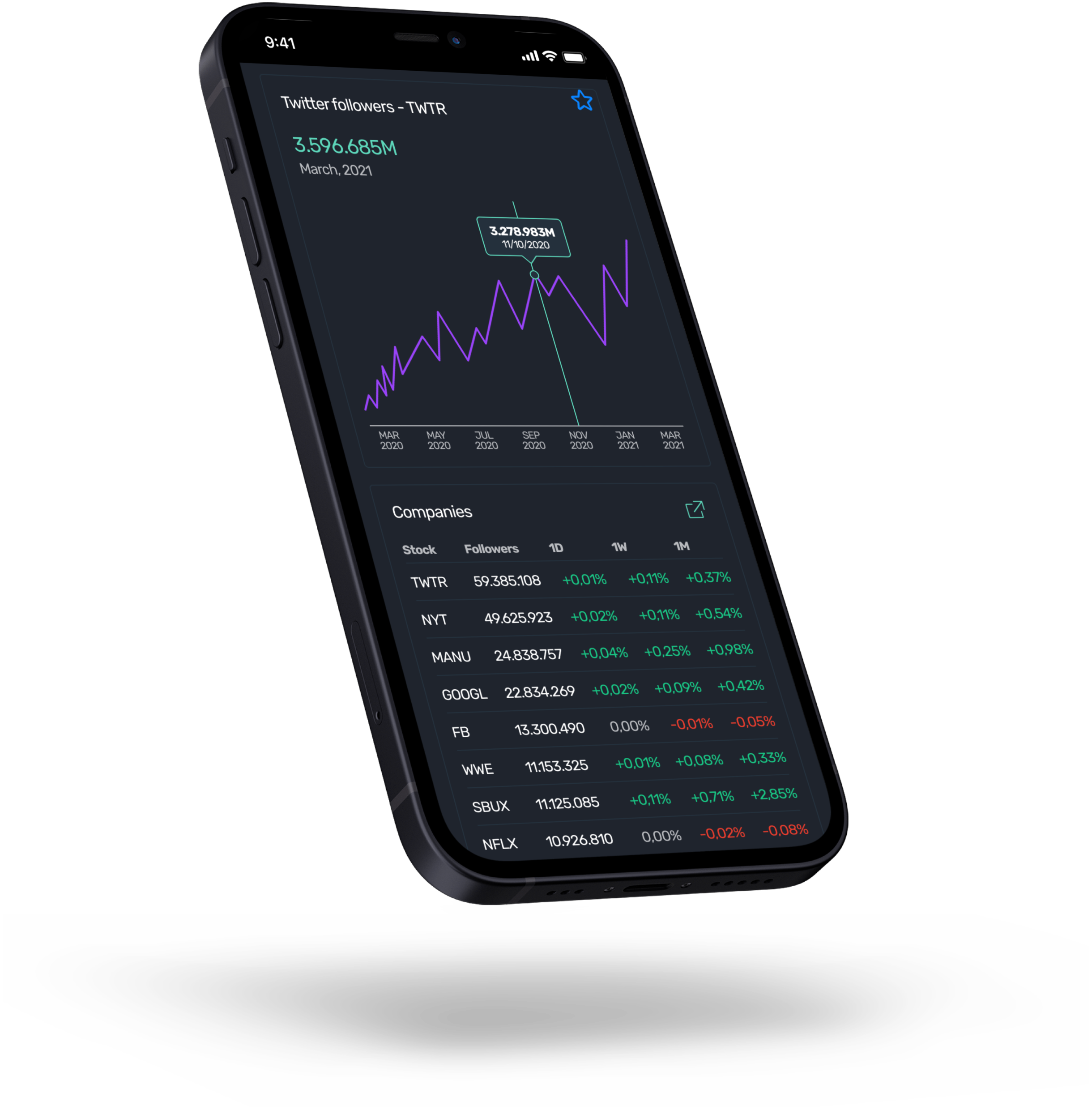
Simplified for a small screen.
Designing the QuiverQuant mobile experience wasn’t as simple as mirroring the web. For one, there’s ample space on a laptop or desktop screen; users can scroll up and down and read long sentences if they wish.
Adapting the datasets and graphs from web to mobile required critical thinking and highly intentional design. We had to investigate several ways of representing the data in mobile — and work with the QuiverQuant team to lose everything that wasn’t necessary.
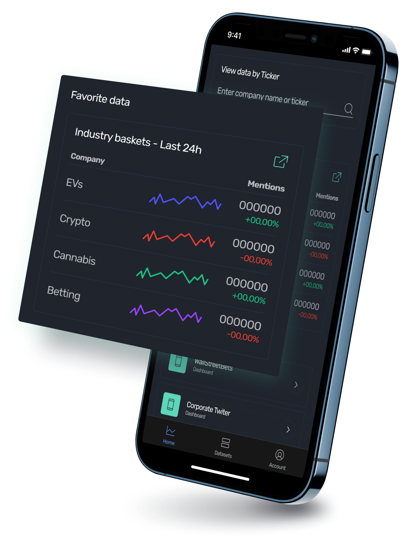
Get your favorite data.
QuiverQuant’s new ‘Favorite’ feature allows users to hone in on the data that interests them most.
Not only does this make the experience more enjoyable and personal, it also gives users a reason to hand over their sign-up information. In an increasingly data-sensitive world, that’s important to get right.
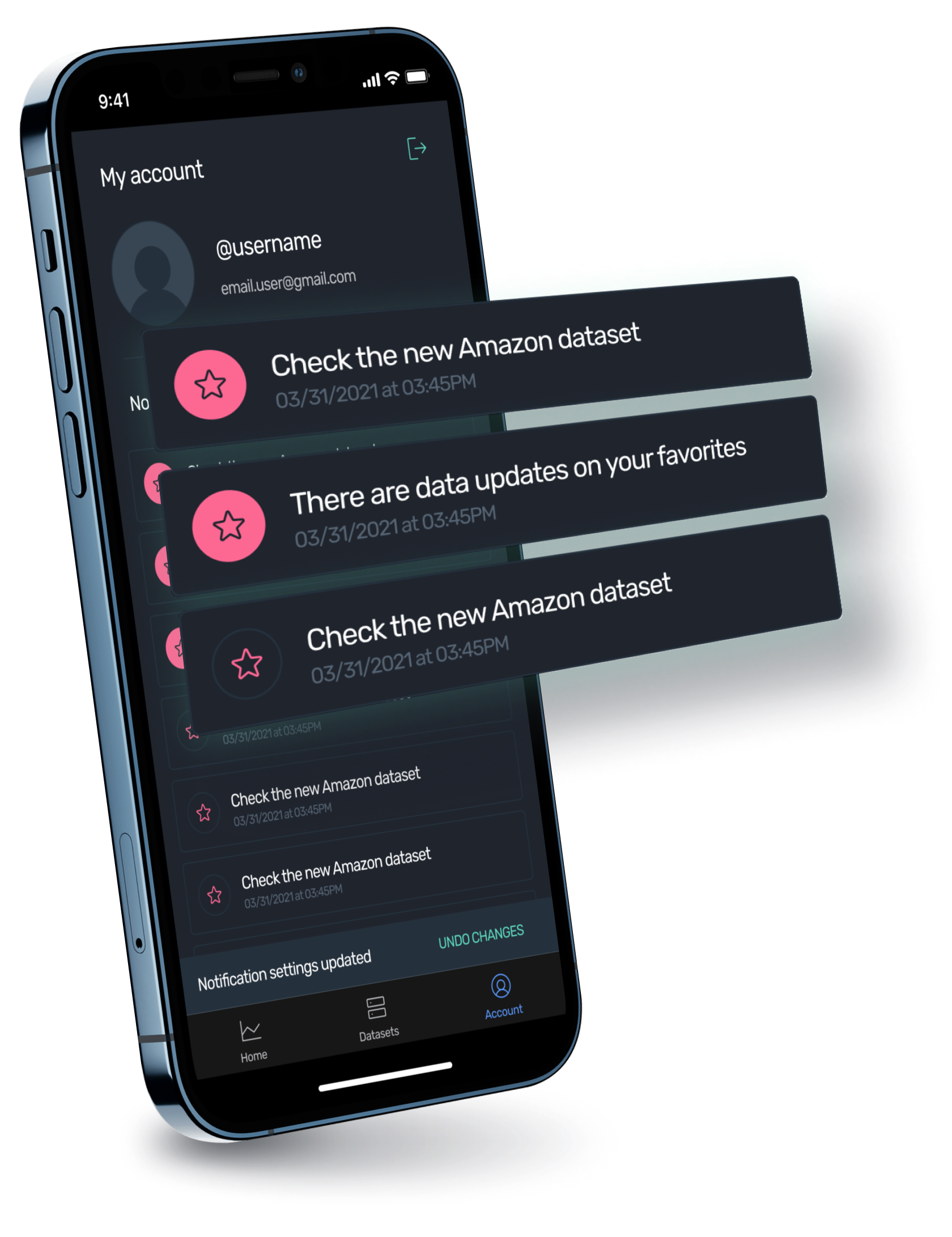
Customized notifications.
Once users have set their ‘favorites’, the app is then able to send custom notifications and keep users in the loop about how the market is changing.
Where the website experience asks users to dedicate time and energy deep-diving into the data, QuiverQuant’s mobile solution is much more of an ‘in real-time’ alternative. It’s easy and habitual — and with notifications pinging up to deliver exciting news, it’s hard to resist as well.
“Their UI work was very impressive, and they made several great improvements to the functionality that we hadn't even thought to ask for.

James Kardatzke
CEO at QuiverQuant

Results
.


Our quality assurance team did a fantastic job and, as a result, there were zero bugs found by users — giving it an Play Store rating of 5.0.
